


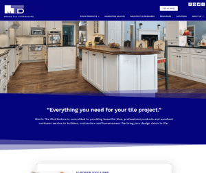
Responsive web design is all the rage these days. It’s everywhere and for good reason.
Mobile web use is growing exponentially and, according to some sources, may pass traditional desktop use in the (very) near future. Therefore, making sure your website works well on both traditional desktop computers and laptops as well as on tablets and smartphones is becoming essential – and that’s what Responsive Web Design is all about.
As you can imagine, designing a website to appear properly on a traditional, larger horizontal computer screen is quite different than designing it to appear properly on a small, often vertical, smartphone screen. And, as if the size difference isn’t enough to give any web designer a whopping headache, there also can be issues with the functionality that is available on smartphones and, of course, usability concerns and ease of use issues with smaller devices.
Not only do designers need to make sure a website looks and works well on multiple devices, but they also need to make sure that each of the site versions is easy to use too.
It used to be that web designers would make a completely separate website for mobile use. That seemed to be a good answer to the mobile problem. This approach allowed them to design a separate website that was tailored specifically for phones and tablets, but this approach also was more expensive (you were making 2 websites after all) and required more upkeep (you had to update 2 sites, rather than just 1).
Then, a pretty smart person named Ethan Marcotte, came up with a better solution … responsive web design.
So, what exactly is responsive web design?
Responsive web design is a design approach that aims to ensure that a website works well on media of all sizes. A website that utilizes a responsive web design approach automatically adapts the layout of the website based on the viewing size of the media being used to view the site. Using Cascading Style Sheets (CSS) and programming in some queries to determine the size of the device being used to view the site, a responsive website will automatically be modified for the viewing screen size – from large PC screens to tablets to smartphones.
Although with responsive web design there are no longer 2 websites to build and maintain, responsive web design is certainly quite a bit more extensive than traditional web design and is usually a more expensive proposition than building a standard website only. Also, because it is often more complicated, the design process can take longer than traditional web design.