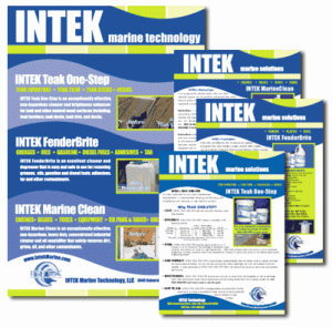
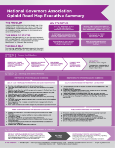
With the thousands of fonts available today, selecting an appropriate font for your print or screen design projects can be a daunting task. The fonts you use add to the overall “look and feel” of the piece and to the visual impact the piece has on the reader. Because fonts have different “personalities” it is important to select a font or fonts that project not only an appropriate style and image, but also one that reflects the expectations of the audience.
Generally speaking, there are three types of fonts and each has it’s own set of traits and uses: serif, sans serif, and decorative fonts.
Serif Fonts
Serif fonts have small lines which decorate some of the main strokes of the letters themselves. Serif fonts often appear more formal than Sans Serif fonts and can feel traditional, scholarly, or business-like. Because the serifs help to define the letters, serif fonts are often easier to discern and read than other font types when printed. For this reason, most printed publications with heavy text often use Serif fonts for the main text/content. Common Serif fonts include Times New Roman, Baskerville, Century Schoolbook, and Garamond.
Sans Serif Fonts
Simply speaking, Sans Serif fonts do not contain the decorative lines that Serif fonts contain (“Sans” is a French word meaning “without”). Sans Serif fonts usually appear less formal than Serif fonts and often feel more modern, fresh, and understated. Sans Serif fonts work very well for reading on screen. Common Sans Serif fonts include Verdana, Helvetica, Tahoma, Geneva, and Gill Sans.
Decorative Fonts
Decorative Fonts are often used for visual impact, but not necessarily for easy reading. For that reason, it is often best to reserve decorative fonts for accents or highlights of text. Decorative fonts include handwriting fonts, or cursive & script fonts.
Fonts of all types usually come in families or groups and can include bold, italic, and bold-italic variants of the font.
Using Fonts in Publications
When selecting a font or fonts for use in a print or web publication, it can be tempting to use many different fonts. However, a good rule of thumb is to use no more than three different fonts per piece: one font for the main body text, one for headings, and, if necessary, one for decoration.
Print Projects
For printed documents, a serif font will work well for the body text. Since headlines should grab the readers attention, they can often be sans serif or decorative fonts, but must be bold and large enough to stand out from the body text (while still being easy to read). Using a Serif font for the body copy and a Sans Serif font for headlines are almost always a good, reliable combination.
Web Based Projects
Computer screens are low resolution and complex serif fonts don’t always translate as well on screen as they do in print. Serif fonts (especially in small sizes) can therefore be much more difficult to read than sans serif fonts of similar size on a screen. For this reason, it is often better to go with Sans Serif fonts for web body text. Be sure to select a font that can be read at different sizes.
Although there are no hard and fast rules for fonts in publications, it is important to remember that, whether printed or displayed on the screen, the piece needs to be easily readable, visually interesting, and should reflect the image needed.


