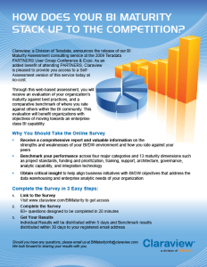
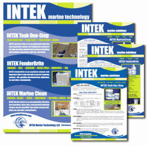
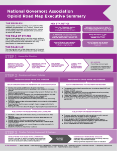
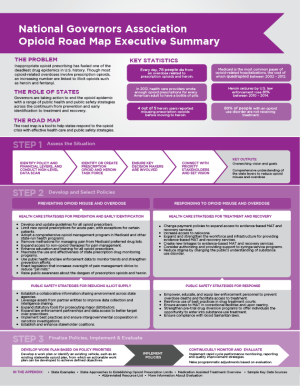
When selecting a font or fonts for use in a print or web publication, it can be tempting to use many different fonts. However, a good rule of thumb is to use no more than three different fonts per piece: one font for the main body text, one for headings, and, if necessary, one for decoration.
Print Projects
For printed documents, a serif font will work well for the body text. Since headlines should grab the readers attention, they can often be sans serif or decorative fonts, but must be bold and large enough to stand out from the body text (while still being easy to read). Using a Serif font for the body copy and a Sans Serif font for headlines are almost always a good, reliable combination.
Web Based Projects
Computer screens are low resolution and complex serif fonts don’t always translate as well on screen as they do in print. Serif fonts (especially in small sizes) can therefore be much more difficult to read than sans serif fonts of similar size on a screen. For this reason, it is often better to go with Sans Serif fonts for web body text. Be sure to select a font that can be read at different sizes.


